


7.3. Styling HTML Forms with Twitter Bootstrap
In ZF3-based web sites, we use the Twitter Bootstrap CSS Framework that provides default
CSS rules for styling forms and form fields. To apply the CSS rules to a form field
(like <input>, <textarea>, etc.), you should assign it the .form-control CSS class. Additionally,
when using labels together with input fields, put the label-input pairs inside of <div> elements
with the .form-group CSS class. For submit buttons, you can use the .btn CSS class plus a theme
class like .btn-default, .btn-primary, etc.
Below, we provide the modified example of the feedback form which uses the Bootstrap styling:
<h1>Contact Us</h1>

<p>
    Please fill out the following form to contact us.
    We appreciate your feedback.
</p>

<form name="contact-form" action="/contactus" method="post">

  <div class="form-group">
    <label for="email">Your E-mail</label>
    <input name="email" type="text" class="form-control"
           placeholder="name@example.com">
  </div>

  <div class="form-group">
    <label for="subject">Subject</label>
    <input name="subject" type="text" class="form-control"
           placeholder="Type subject here">
  </div>

  <div class="form-group">
    <label for="body">Message Body</label>
    <textarea name="body" class="form-control" rows="6"
              placeholder="Type message text here"></textarea>
  </div>

  <input name="submit" type="submit"
         class="btn btn-primary" value="Submit">
</form>
The visualization of the form is presented in figure 7.5.
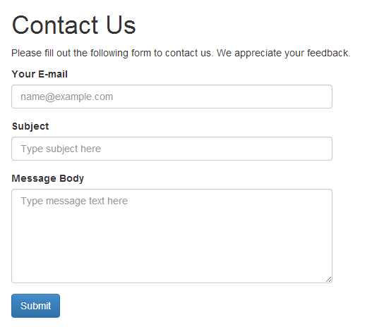 Figure 7.5. Styled feedback form
Because Twitter Bootstrap is designed to support mobile phones, tablets, and desktops, it makes the form fields as wide as the size of the screen. This may make your form too wide and hard to understand. To limit form width, you can use the Bootstrap-provided grid, like in the example below:
<div class="row">
  <div class="col-md-6">
    <form>
      ...
    </form>
  </div>
</div>
In the HTML markup above, we put a form inside of the 6-column-width grid cell, which makes the form half the width of the screen.