


6.3. Modifying the Default Page Layout
To demonstrate how you can define your own page layout, we will modify the original layout of the Zend Skeleton Application website. We want to make it display the "Hello world" page title, the "Hello world!" header text at the top, the navigation bar and breadcrumbs below the header, page content placeholder in the middle of the page, and the footer with the copyright information at the bottom (see figure 6.4 for an example of what we are trying to achieve).
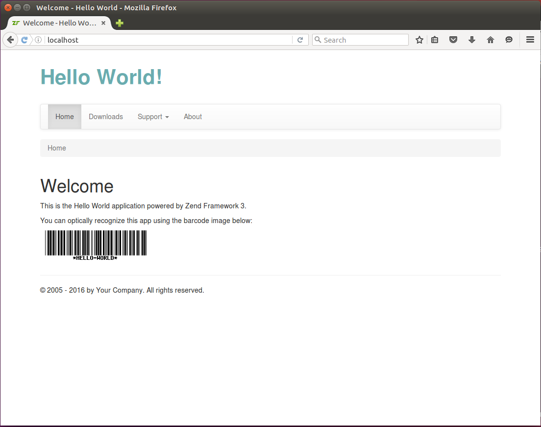 Figure 6.4. Resulting Page Layout
Let's start with the "Hello World" page title. We replace the lines 6-7 in the layout.phtml file as follows:
<?= $this->headTitle('Hello World')->setSeparator(' - ')->setAutoEscape(false) ?>
Next, we will use the Bootstrap-provided grid system for arranging the main blocks on the page.
Replace the HTML code of the <body> element (lines 28-63) with the following one:
<body>
<div class="container">
<div class="row">
<!-- Page header -->
<div class="col-md-4">
<div class="app-caption">Hello World!</div>
</div>
</div>
<div class="row">
<div class="col-md-12">
<!-- Navigation bar -->
</div>
</div>
<div class="row">
<div class="col-md-12">
<!-- Breadcrumbs -->
</div>
</div>
<div class="row">
<div class="col-md-12">
<!-- Page content placeholder -->
<?= $this->content; ?>
</div>
</div>
<div class="row">
<div class="col-md-12">
<hr>
<p>© 2005 - <?= date('Y') ?> by Your Company. All rights reserved.</p>
</div>
</div> <!-- /container -->
<?php echo $this->inlineScript() ?>
</body>
In the code above, we defined the <div> element with the container class and put
the <div> elements of the grid inside of it. The grid consists of 5 rows:
The page header containing the "Hello World!" text (lines 3-8). The header text spans four grid columns. For styling the text, we use our custom CSS class
app-caption(we will define this class in style.css file a little bit later).We left the space for navigation bar interface component in line 11.
In line 16, we have the space for breadcrumbs component.
In line 22, we have the page content placeholder. When the renderer evaluates the page, it will echo the value of the
$contentvariable, so the actual page content will be substituted here.And in lines 25-29, we provided the page footer with the text "(c) 2013 by Your Company. All rights reserved." You can change this text and substitute your company name here, if you wish.
Next, we put the navigation bar in the corresponding grid row:
<!-- Navigation bar -->
<nav class="navbar navbar-default" role="navigation">
  <div class="collapse navbar-collapse navbar-ex1-collapse">
    <ul class="nav navbar-nav">
      <li class="active">
        <a href="<?= $this->url('home') ?>">Home</a>
      </li>
      <li>
        <a href="<?= $this->url('application', ['action'=>'downloads']) ?>">
          Downloads
        </a>
      </li>
      <li class="dropdown">
        <a href="#" class="dropdown-toggle" data-toggle="dropdown">
          Support <b class="caret"></b>
          <ul class="dropdown-menu">
            <li>
              <a href="<?= $this->url('doc', ['page'=>'contents']) ?>">
                Documentation
              </a>
            </li>
            <li>
              <a href="<?= $this->url('static', ['page'=>'help']) ?>">
                Help
              </a>
            </li>
          </ul>
        </a>
      </li>
      <li>
        <a href="<?= $this->url('about') ?>">About</a>
      </li>
    </ul>
    </div>
</nav>
In the code above, we used the navbar interface component provided by the Bootstrap.
We also used the Url view helper to insert the links to the navigation items.
We discussed the usage of the
Urlview helper in the Generating URLs from Route section in Routing.
Next, put the breadcrumbs component to the corresponding grid row:
<!-- Breadcrumbs -->
<ol class="breadcrumb">
  <li class="active">Home</li>
</ol>
Finally, we need to provide a couple of custom CSS rules to fine-tune the look and feel. We define our own CSS rules in the style.css stylesheet.
We want to make the "Hello World!" header text to use larger bold font and use a nice looking color. To do this, open the style.css file, and append the following lines to the end:
div.app-caption {
  padding: 25px 0px;
  font-size: 3.0em;
  font-weight: bold;
  color: #6aacaf
}
In the CSS code above, we created the app-caption class which can be applied to <div>
element and defining the 25 pixels vertical padding, large font size, bold text style and the
hexadecimal representation of the RGB text color.
By default, in skeleton application, the navbar is pinned to page top, and the CSS
rule for the page body defines the 20 pixels top padding to leave space for it.
Since in our Hello World example we've unpinned the navigation bar from top of the page and
placed it in page flow, we need to remove the padding from page body top. To do that, edit
the body CSS rule in the style.css file and make it look like the one below:
body {
  padding-bottom: 40px;
}
Great, we've completed the page layout template! To see the result of our changes, open the site in your browser, you should see the page as in figure 6.4. You can click the links in navigation bar to visit the pages like About or Documentation, etc. The content of a particular page is put into the content placeholder of our layout.
The result can be seen in action in the Hello World sample application that is part of this book's example code available on GitHub.