


7.14. Example: Creating the View Template for the Contact Form
Now we are ready to define the presentation for our feedback form. If you remember, earlier we added the contact-us.phtml view template in application/index/ directory under the module's view/ directory. Replace the code in that file with the following:
<?php
$form = $this->form;
$form->prepare();
?>

<?= $this->form()->openTag($form); ?>

<?= $this->formLabel($form->get('email')); ?>
<?= $this->formElement($form->get('email')); ?>
<?= $this->formElementErrors($form->get('email')); ?>

<?= $this->formLabel($form->get('subject')); ?>
<?= $this->formElement($form->get('subject')); ?>
<?= $this->formElementErrors($form->get('subject')); ?>

<?= $this->formLabel($form->get('body')); ?>
<?= $this->formElement($form->get('body')); ?>
<?= $this->formElementErrors($form->get('body')); ?>

<?= $this->formElement($form->get('submit')); ?>

<?= $this->form()->closeTag(); ?>
As you can see from the code above, we do the following things to render the form:
In line 2, we access the
$formvariable passed from the controller's action.In line 3, we call the
Form'sprepare()method to prepare the form for rendering. Please note that calling this method is very important. If you forget to do that, there may be some undesired rendering problems.In line 6, we call the
openTag()method of theFormview helper. Its purpose is to render the opening<form>tag and its attributes. The method takes a single argument -- an instance of the form model. Paired closing</form>tag is rendered in line 22 with the help of thecloseTag()method of theFormview helper.In lines 8-10, we render the E-mail field's label, the text field itself and (possible) validation errors with the help of the
FormLabel,FormElementandFormElementErrorsview helpers. Those helpers take the instance of the form model's element as a single argument. We get an instance of the element with theget()method provided by theFormbase class.In lines 12-14, by analogy, we render the Subject field, its label and validation errors.
And in lines 16-18, we render the label, the field and the validation errors for the body text area field.
In line 20, we render the Submit button.
When the view template renderer evaluates this code, it will produce the HTML output like below:
<form action="/contact" method="post" name="contact-form">
  <label for="email">Your E-mail</label>
  <input type="text" name="email" id="email" value="">

  <label for="subject">Subject</label>
  <input name="subject" type="text" id="subject" value="">

  <label for="body">Message Body</label>
  <textarea name="body" id="body"></textarea>

  <input name="submit" type="submit" value="Submit">
</form>
In the code above, we mostly used the
FormElement,FormElementErrorsandFormLabelview helpers. You may use the genericFormRoworFormview helpers if you want to reduce the amount of code to write, but this may result in less control of form decoration.
If certain fields have validation errors, those errors will be
outputted below the field in the form of the <ul> unordered HTML list.
For example, if you enter the "123@hostname" into E-mail form field,
you would receive the following validation errors:
<label for="email">Your E-mail</label>
<input type="text" name="email" value="123@hostname">
<ul>
<li>'hostname' is not a valid hostname for the email address</li>
<li>The input does not match the expected structure for a DNS hostname</li>
<li>The input appears to be a local network name but local network names
are not allowed</li>
</ul>
7.14.1. Applying the Bootstrap CSS Styles to Form
The HTML markup above is missing CSS styling. What we want to achieve is to use Twitter Bootstrap CSS classes to give the form a nice, professional-looking appearance. To add Bootstrap styling to the form, you have to modify the code in the .phtml file to make it look like below:
<?php
$form = $this->form;
$form->prepare();

$form->get('email')->setAttributes([
  'class'=>'form-control',
  'placeholder'=>'name@example.com'
  ]);

$form->get('subject')->setAttributes([
  'class'=>'form-control',
  'placeholder'=>'Type subject here'
  ]);

$form->get('body')->setAttributes([
  'class'=>'form-control',
  'rows'=>6,
  'placeholder'=>'Type message text here'
  ]);

$form->get('submit')->setAttributes(['class'=>'btn btn-primary']);
?>

<h1>Contact Us</h1>

<p>
  Please fill out the following form to contact us.
  We appreciate your feedback.
</p>

<div class="row">
  <div class="col-md-6">
    <?= $this->form()->openTag($form); ?>

    <div class="form-group">
      <?= $this->formLabel($form->get('email')); ?>
      <?= $this->formElement($form->get('email')); ?>
      <?= $this->formElementErrors($form->get('email')); ?>
    </div>

    <div class="form-group">
      <?= $this->formLabel($form->get('subject')); ?>
      <?= $this->formElement($form->get('subject')); ?>
      <?= $this->formElementErrors($form->get('subject')); ?>
    </div>

    <div class="form-group">
      <?= $this->formLabel($form->get('body')); ?>
      <?= $this->formElement($form->get('body')); ?>
      <?= $this->formElementErrors($form->get('body')); ?>
    </div>

    <?= $this->formElement($form->get('submit')); ?>

    <?= $this->form()->closeTag(); ?>
  </div>
</div>
In the code above, we added the .form-control CSS class to every
input field in the form. We did that with the setAttribute() method (see lines 5, 10 and 15).
With that method, we also added the "placeholder" attribute to define the
nice-looking placeholder text when a field is empty. For the "body" field,
we added the "rows" attribute defining the height of the field (6 rows).
For the form's Submit button, we use the .btn and .btn-primary
CSS classes (see line 21).
We also put label-input pairs inside of <div> elements with .form-group
CSS class (lines 35, 41, 47).
We put a form inside of the 6-column-width grid cell, which makes the form half the width of the screen (look at lines 31-32).
Sometimes it is impossible to use Twitter Bootstrap styling with standard ZF3 form view helpers. For example, standard view helpers
FormCheckboxandFormRadiocan't be tweaked to support Bootstrap styles. Fortunately, there is a third-party module neilime/zf2-twb-bundle that you can install with Composer (do not be confused with module's name - it supports ZF3 as well). This module provides convenient view helpers for rendering ZF3 forms and applying Bootstrap styling to them. It works transparently, so once you installed the module, standard ZF3 form view helpers become replaced with module-provided form view helpers, so you don't need to change your view template code.
7.14.2. Styling the Validation Errors List
The error messages on your form, by default, look like a typical unordered list (<ul>). To
give them a nice visual appearance, we add a couple of CSS rules to the style.css file
in APP_DIR/public directory:
form ul {
  list-style-type: none;
  padding: 0px;
  margin: 0px 5px;
}

form ul li {
  color: red;
}
The CSS rules above will remove bullets from the list and make validation error messages appear in red.
7.14.3. Adding the "Thank You" & "Error Sending Email" Pages
The last small thing we will do is preparing the view templates for the "Thank You" and "Error Sending Email" pages.
Add the thank-you.phtml view template in application/index/ directory under the module's view/ directory. Put the following HTML markup into the view template file:
<h1>Thank You!</h1>

<p>
  <div class="alert alert-success">
    We will respond to the E-mail address you have provided.
  </div>
</p>
Next, add the send-error.phtml view template file. The HTML markup for the Error Sending Email page is presented below:
<h1>Error Sending Email!</h1>

<p>
  <div class="alert alert-warning">
    Sorry, but we had an unexpected problem when trying to deliver
    your message. Please try again later.
  </div>
</p>
7.14.4. Results
Congratulations! Now, if you open the "http://localhost/contactus" URL in your web browser, you should see a page like that shown in figure 7.20.
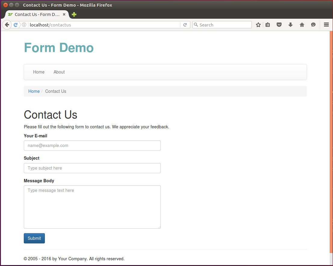 Figure 7.20. Contact Form
If you enter some invalid data in the form and click the Submit button, you should see the validation errors (figure 7.21).
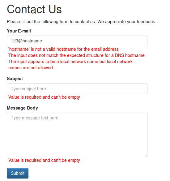 Figure 7.21. Form validation errors
Entering the correct E-mail, subject and message text and submitting the form results in sending the message and displaying the Thank You page (see figure 7.22).
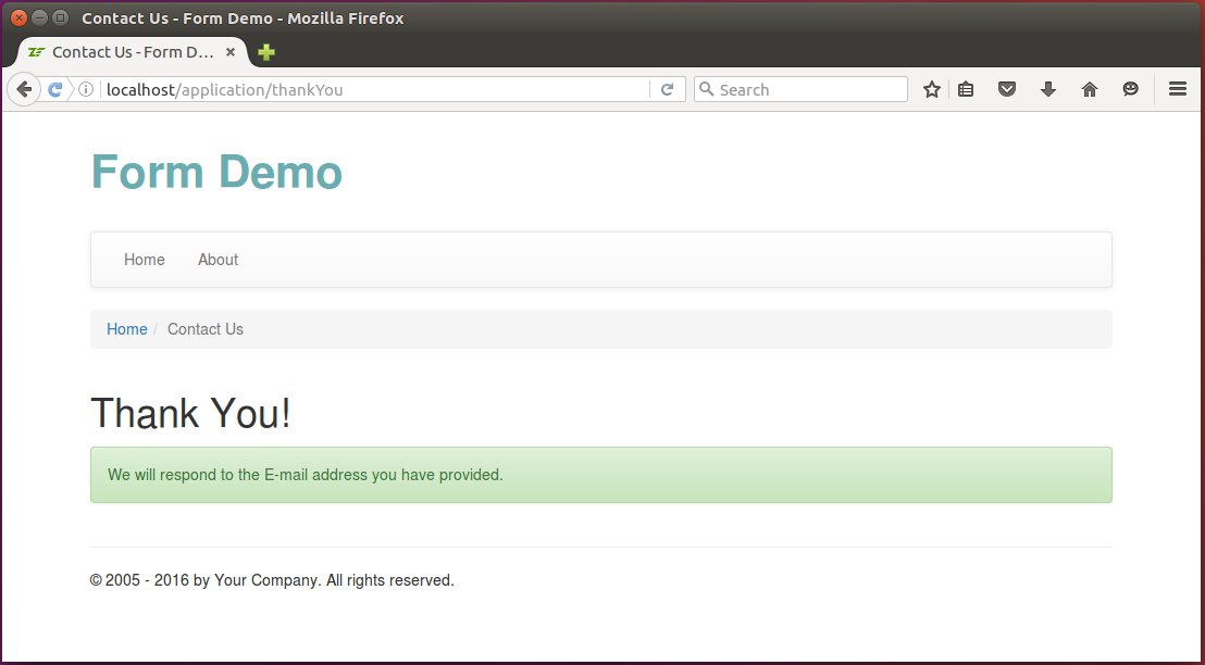 Figure 7.22. Thank You page
On a sending failure, you will see the Error Sending Email page (see figure 7.23 for example):
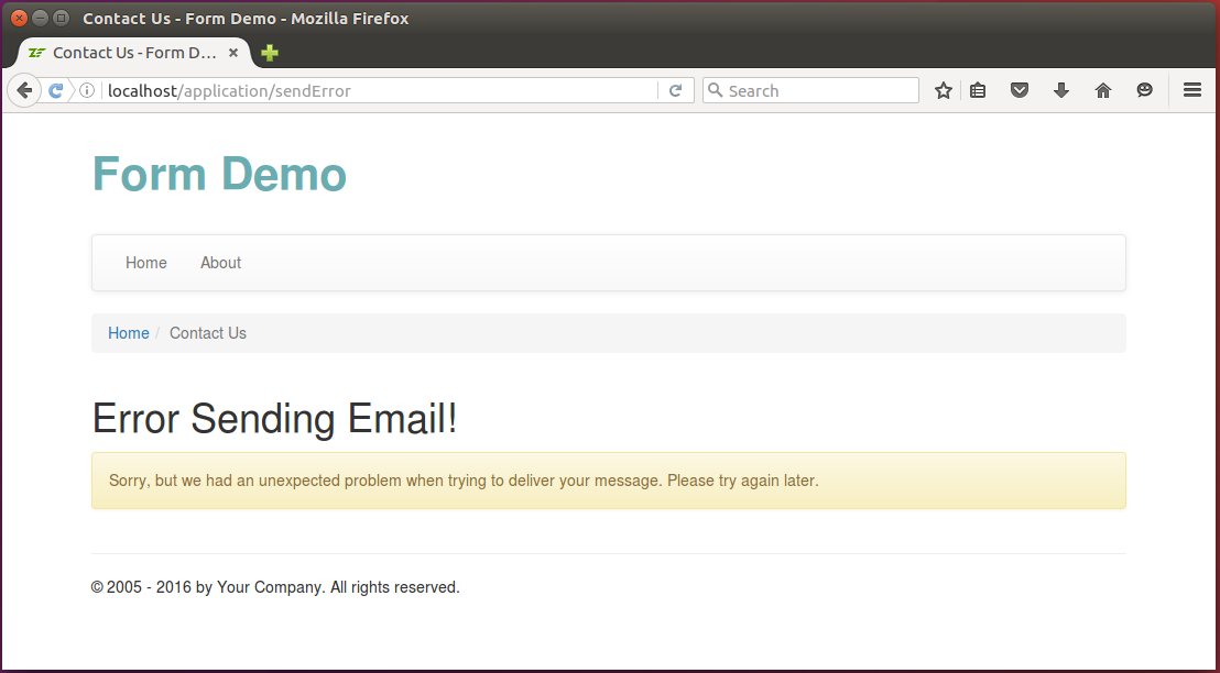 Figure 7.23. Error Sending Email page
You can see the Contact Us form in action in the Form Demo sample application bundled with this book.