


Grid System
In most websites, content is required to be organized in a table-like structure having rows and columns. In figure C.2, you can see an example layout of a typical website: it has the header block with a logo, the sidebar at the left, page content area in the middle, the ads bar at the right, and the footer at the bottom of the page. These blocks are arranged in a grid, although grid cells have unequal width (some cells can span several columns).
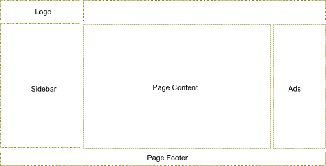 Figure C.2. A typical site layout
Bootstrap provides a simple layout grid system to make it easy to arrange content on your pages in rows and columns.
Each row consists of up to 12 columns 51 (figure C.3). Column width is flexible and depends on the width of the grid container element. Column height may vary depending on the height of the content of the cell. The space between columns is 30 pixels (15 pixels padding at both sides of the column).
51) You are not required to put exactly 12 columns in a row, there may be fewer columns. If you have fewer columns, the space to the right of the last column will be empty.
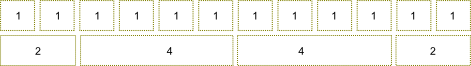 Figure C.3. Bootstrap grid system
Columns can be spanned, so a single cell takes the space of several columns. For example, in figure C.3, the upper grid row consists of 12 columns, and each cell spans a single column. In the bottom row, the first cell spans 2 columns, the second and the third ones span 4 columns each, and the fourth cell spans 2 columns (in total we have 12 columns).
Why does Bootstrap's grid consist of only 12 columns?
Probably because 12 columns are enough for most websites. If you have more fine-grained grid with lots of columns, it would be more difficult to compute column spans without the calculator. Fortunately, Bootstrap allows for customizing the count of columns per row, so you can have as many columns as you wish.
Defining the Grid
To arrange elements in a grid on your web page, you start from defining the
container by adding a <div> element having the .container CSS class.
To add a new row to the grid, use a <div> element having the .row
CSS class, as shown in the example below:
<div class="container">
  <div class="row">
  ...
  </div>
</div>
To add columns, you use <div> elements with CSS class names varying from .col-md-1
to .col-md-12. The number in the class name specifies how many columns each grid cell
will span:
<div class="container">
  <div class="row">
    <div class="col-md-1">Cell 1</div>
    <div class="col-md-5">Cell 2</div>
    <div class="col-md-6">Cell 3</div>
  </div>
</div>
In the example above, we have three cells. The first cell has a width of 1 (it
uses the .col-md-1 class), the second cell spans 5 grid columns (class .col-md-5)
and the third cell spans 6 columns (class .col-md-6).
As another example, let's define the layout that we saw in figure C.2. The layout has the header (logo spans 3 columns), the main content area (spans 7 columns), the sidebar (spans 3 columns), the advertisements bar (2 columns) and the footer. To produce this layout, we can use the following HTML code:
<div class="container">
  <!-- Header -->
  <div class="row">
    <div class="col-md-3">Logo</div>
    <div class="col-md-9"></div>
  </div>
  <!-- Body-->
  <div class="row">
    <div class="col-md-3">Sidebar</div>
    <div class="col-md-7">Page Content</div>
    <div class="col-md-2">Ads</div>
  </div>
  <!-- Footer -->
  <div class="row">
    <div class="col-md-12">Page Footer</div>
  </div>
</div>
Offsetting Columns
In real web pages, sometimes the grid needs to contain "empty holes". You can define
such holes by offsetting cells to the right with the
help of CSS classes named from .col-md-offset-1 to .col-md-offset-12. The number in the
class name specifies how many columns should be skipped.
For example, look at figure C.4:
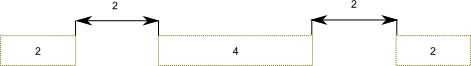 Figure C.4. Column offsets
The grid above has three cells, the latter two cells are offsetted to the right, making empty holes. To define the grid like in figure C.4, you can use the following HTML code:
<div class="container">
  <div class="row">
    <div class="col-md-2">Cell 1</div>
    <div class="col-md-4 col-md-offset-2">Cell 2</div>
    <div class="col-md-2 col-md-offset-2">Cell 3</div>
  </div>
</div>
Nesting Grids
You can create complex page layouts by nesting grids (for example, look at figure C.5).
To nest your content, you add a new <div> element containing .row class, and set of
.col-md-* columns within an existing .col-md-* column.
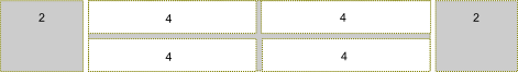 Figure C.5. Nested grid
To produce the grid as shown in figure C.5, you can use the following HTML code:
<div class="container">
  <div class="row">
    <div class="col-md-2">Cell 1</div>
    <div class="col-md-8">
      <!-- Nested grid -->
      <div class="row">
        <div class="col-md-4">Cell 21</div>
        <div class="col-md-4">Cell 22</div>
      </div>
      <div class="row">
        <div class="col-md-4">Cell 23</div>
        <div class="col-md-4">Cell 24</div>
      </div>
    </div>
    <div class="col-md-2">Cell 3</div>
  </div>
</div>
In the example above, we defined the grid consisting of three cells (denoted by gray color): the first cell spanning 2 columns, the second cell spanning 8 columns and the third cell spanning 2 columns. Then we put the nested grid rows inside of the second cell. Because the parent cell spans 8 columns, the child grid consists of 8 columns, too.
"Mobile First" Concept
Twitter Bootstrap is designed to support different devices varying from wide displays to tablets and mobile phones. By this reason, the layout grid is adapted to different screen resolutions.
This is also called the responsiveness, or the "mobile first" concept. Bootstrap is mobile-first, which means your website will be viewable and usable on any-sized screen. However, this does not free you of painstaking preparation and planning the layout.
This adaptation is performed in two ways. The first way is that the column width within the grid is flexible. For example, if you increase the size of the browser window, the grid will be scaled accordingly to fill the whole space.
But what will happen if your web page is too wide for the display? To see the hidden part, the site visitor will need to scroll it to the right. For mobile phones and other low-resolution devices this is not a good approach. Instead, it would be better for the grid to become "stacked" below some screen width. When the grid is stacked, its rows are transformed, making cells to be positioned one below another (see figure C.6 for example).
To better control when the grid becomes "stacked", Bootstrap provides you with additional
CSS classes: .col-xs-1 to col-xs-12 (the "xs" abbreviation means "extra-small" devices, or phones),
.col-sm-1 to .col-sm-12 ("sm" stands for "small devices", or tablets), and .col-lg-1 to .col-lg-12
(large devices, or wide displays). These classes can be used together with the .col-md-1 -- .col-md-12
classes, that we already used (the "md" abbreviation means "medium devices", or desktops).
For example, .col-md-* classes define the grid which will become "stacked" when the screen is
below 992 pixels wide, and horizontal for wider screens. The .col-sm-* can be used to make the
grid "stacked" below 768 pixel screen width, and horizontal above this point. The .col-xs-*
class makes the grid always horizontal, not depending on the screen width.
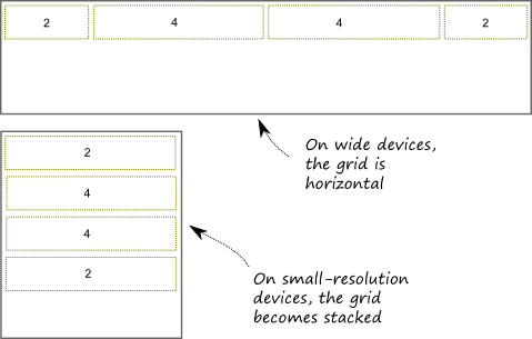 Figure C.6. Grid adapts to screen size
Table C.1 provides the summary of available grid classes and their breakdown page width.
| Class name | Breakdown width |
|---|---|
.col-xs-* |
<768px |
.col-sm-* |
>=768px |
.col-md-* |
>=992px |
.col-lg-* |
>=1200px |
Bootstrap's grid system greatly simplifies the positioning of elements on a web page. However, using the grid system is not mandatory. For example, sometimes you may need a much more complex layout, and the simple grid system will be insufficient. In such a case, you can create and use your custom layout by using
<table>or<div>HTML elements.